Thursday, June 27, 2013

Here's something!

I've been kind of neglecting this blog.. until I realized there were still people coming to read it?! And I felt bad because I wasn't posting anything new. I'm not a very good blogger :( but hey here's something! I've been meaning to post this one up but I somehow forgot about it (as always.)

The prototype:
it wouldn't be my work without a cat~

The illustrated image:

The finished version:
Had to slap on my info on the back cause the idea was to build a promo. naaaht very practical unless I were rich and owned my own printer& die cut machine! The finished version isn't too pretty because hand cutting thick color-printed cardstock just doesn't.. work. The rough white edges make me cringe x(

Sunday, May 19, 2013

Silkscreen book #2

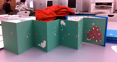
Finally uploading photos of my second book from silkscreen class! It's actually bound accordion book style but I couldn't take a photo of all the pages pulled out without exposing my messy bedroom in the background so... hoohoo. I'm more happy with the cover and the binding than the actual images :( oh why is binding always more fun than printing...whyyy... But I think I learned a whole lot about silkscreening from printing this book. A lot of it was probably stuff I would've known if I had just done a lot more printing, but all throughout the semester I was so caught up in creating perfect pieces that I was afraid to just print stuff. I need to let gooooooo, let looose~

SOI Reception

Friday was the opening reception for the Society of Illustrators 2013 student competition! It was so packed...with both people AND amaaaazing artwork! so much talent.. SO MUCH TALENT EVERYWHERE! It was super interesting, and I was in awe the whole time I walked around the exhibition. I was busy writing down names until I realized I had the catalog with all the artists and their illos haha


The show is up until June 5th at the Society of Illustrators on 63rd st~ 

Friday, April 26, 2013

Tote Tote

First time silkscreening on something other than paper (or book cover fabric)! I was very VERY nervous while printing. I still get super tense just silkscreening on paper! But a pretty nice turnout for a first time, I think. Only messed up on one! yeey. The design is from my sketchbook from last fall when senior year had just begun. Funny how different it looks from my recent works!

Speaking of which, a couple of new pieces up on my website! Senior year is (unofficially) over! I learned and grew so much this year. Thank you Jillian for really- everything. I am truly, truly grateful that I was able to take my portfolio class with such an incredible, talented, and caring instructor. I'm going to miss our class so much! :*(

Sunday, April 14, 2013

Fortune Cookie Pop Up

"Suppose you can get what you want..."


I had a lot of fun with this one! I was especially fond of this piece because the format was like that of a picture book. Sure it's only 4 pages but... nevermind that!
There was a sense of thrill every time I finished gluing all the layers and pieces of a spread together and the page was complete. So so fun! Cutting out the pieces took a very, very long time especially because of the windows, but somehow it was annoying and fun at the same time. I always get a strange sense of enjoyment out of doing tedious work.. probably because they're somewhat mindless.. and therefore soothing?

Here's my favorite piece from this pop up. Didn't get much spotlight because that spread is horrible and I hate to show it :-x but..but.. he's too cute.


Tuesday, March 19, 2013

Hide and Seek

Early last week I finished my 'Hide and Seek' pop up. tada! Printing was.. argeeewughggheoa... no surprise there. had to run around to several different printing places until I realized I was just wasting time and $$$. So I just worked with the best I got. Overall, it turned out pretty okay, I think. 


Would've definitely liked to add more to it though - more trees, more animals, more variety in terms of the mechanism. This pop up was so much more fun than the Rudolph one. Maybe it was because the mechanisms were far simpler, but I think it was because I was building a story as I was illustrating and constructing the pop up. So much more substance and layers- both figuratively and literally~
Pop up is sososo difficult. I really love building things and putting things together ..but actually creating the pieces myself? oy vey x(

Saturday, March 2, 2013

Firsts and Seconds

Last week I finally finished my first silkscreen book. It was my first time silkscreening so there were a lot of mishaps and many many.. many many many frustrating moments. I gotta admit I kind of hated this book from the beginning because I didn't like my illustration :$ We're starting our second book now so I'm trying to plan it better. This was our first book so it was more like a practice/learn the process type of thing. 


Right now I'm in the process of creating my second pop up project. I've gotten the prototype done so I just need to illustrate it and assemble the finished piece. This time I have to take care of the back art as well, which means I'll have to get the pieces printed double sided.. and from what I've previously dealt with at the local print services, it's going to be another frustrating-hair-pulling experience :( GAH how wish I had my own printer.


My first fully illustrated pop up was Rudolph. It wasn't until I finished the whole thing that I realized the image didn't make sense.. it's just a floating head and some landscape. I obviously wasn't thinking about the illustration portion when I was making the prototype. o0ops.


I haven't made that many pop ups yet - just a bunch of prototypes mostly - but from what I've done so far and seen others do, I really like the clean paper-only prototypes much better than the illustrated pop ups. meeh